
The deep connection between data and story
Part one of a two part essay on realizing the full potential of data journalism.

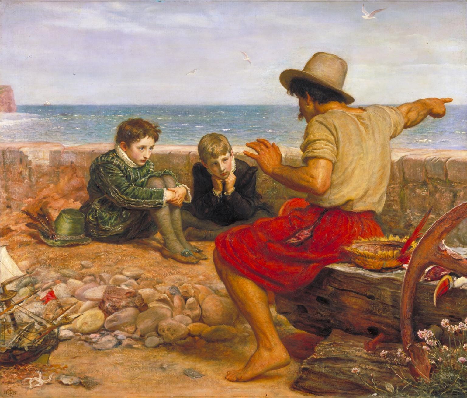
_-_The_Boyhood_of_Raleigh_-_N01691_-_National_Gallery.jpg)
This is the first installment of a two part essay. The second half will be linked here when it is available.
As the grandchild of a biologist, but the child of English faculty members, I’ve long held a famous 1959 lecture by the British writer-physicist C.P. Snow as my watchword. It was called “The Two Cultures and the Scientific Revolution,” and in it, Snow described a situation in which science and math people, and literary and languages people, had become polarized:
Literary intellectuals at one pole—at the other scientists, and as the most representative, the physical scientists. Between the two a gulf of mutual incomprehension—sometimes (particularly among the young) hostility and dislike, but most of all lack of understanding.
As I got a college English degree and proclaimed myself a science writer, I set out to bridge this gap as best I could. But it took a long time to realize how to create my best work at Snow’s interface. It took getting into data journalism.
What’s that? Data journalism and AI scholar Bahareh Heravi, of the University of Surrey, defines it as follows:
…finding – in data – stories that are of interest to the public and presenting them in the most appropriate manner for public use and reuse.
This may sound simple. But in fact, I now believe that the identification of narrative journalistic stories in scientific data represents the epitome of Snowean synthesis. Granted, it is not easy work. And I’m only a modest guide. I’ve written vastly more analytically shaped articles than narrative-driven ones, though my narrative work includes these stories, two of which will be discussed more below (and though I plan to continue to use many of the methods described here moving forward).
But first, we need to get past some confusions about the terminology needed to make the case.
What “narrative” and “story” really mean
The two words above are widely used and even overused, in a way that, frankly, gets pretty confusing.
Journalists, for instance, call every article we publish a “story.” Yet the classic inverted pyramid, a structure in which news importance determines the order in which information is presented, is actually often contrasted by scholars with approaches structured around narrative, or storytelling.
To help clear matters up, let’s go back to one of the classic definitions. Here’s E.M. Forster defining “story” in Aspects of the Novel, while using “narrative” to mean something like the process of telling:
It is a narrative of events arranged in their time sequence—dinner coming after breakfast, Tuesday after Monday, decay after death, and so on.
There are myriad other definitions of these terms. In journalism in particular, the term “narrative” tends to be used in the way Forster uses “story,” probably because in journalism everything gets called a story!
But I think there’s general agreement with Forster that what makes this kind of content distinct from other forms is its presentation of events that unfold in time. In addition, the events in question generally happen to some character, or characters, fictional or otherwise (in nonfiction, these can also be called subjects). Character can be broadly defined: an animal, even an inanimate object.
This is also of course what makes stories so relatable and powerful.
“We experience the world as humans who have goals, organize information to advance our goals, and we progress temporally through the world,” explained Raymond Mar, a psychologist at York University in Canada who studies narratives and how our brains process them. “And that’s what stories are, events arranged around a protagonist’s goals, in a temporal sequence. They map rather well onto how we experience life, and that’s why they’re so easy for us to apprehend, so attractive.”
Unlike with fiction, in nonfiction journalism, narrative is often a matter of degree. Many “stories” will start out with a narrative structure or with scenes, for instance, but then flip back to a more analytical organization. One reason is that in nonfiction, you are often limited by the facts, with only so many confirmed, documented events on the timeline.
And there the story ends, even if the writing doesn’t.
Data leads to stories
With our definitional luggage now stowed, let me begin to explain how data can enrich nonfiction narrative journalism. The first way is by broadening the process of identifying which story to tell in the first place.
To show this, let’s suppose that you have, you know, data.
For this post, I updated a dataset that lay behind a quite impactful, multimedia, narrative-driven story of mine (with Zoeann Murphy and Simon Ducroquet) from 2022 in The Washington Post. What you see below are rates of sea level rise over the last 30 years at 93 sites across the contiguous U.S., based on data from NOAA’s sea level trends site.
I want to give credit here to John Muyskens, the Washington Post graphics journalist who formalized the original analysis of these data, and also to thank Patricia Wiberg of UVA for looking over my own updated version, and offering helpful advice. The core methodology is described in more detail at the end of the original Post story.
This mapped version of the data is definitely more familiar to most of us. But a dotplot version, breaking the data up by region, accentuates the differences even more:
Clearly, U.S. sea level rise rates are very uneven.
In 2022, examining an earlier version of these data, I began to look for a story in Virginia, where as you can see, sea level rise rates are generally quite high. I searched more closely within the state and from there, began to focus on the Eastern Shore.
It still took much more work before we identified the actual story. It was a journey story, both for an individual family and also a community. It centrally featured Buddy Bell, the second to last person born on Hog Island, a barrier island off the coast near Oyster, Va., and his family. It was their story of leaving that island, coming to the mainland, and how the Oyster community founded then faces a new challenge today that sounds strikingly like the old one.
Here’s what Hog Island, now abandoned, looks like today:
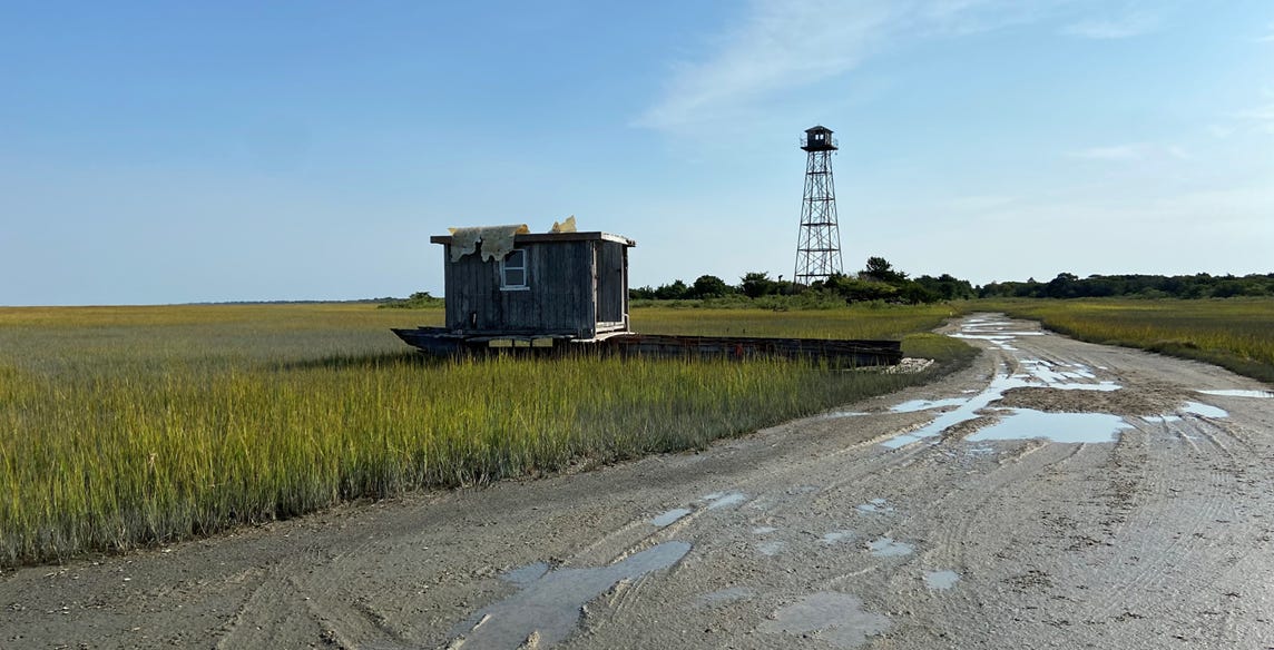
I worked with a skilled video journalist, Zoeann Murphy, on this story, and through video, many of the characters told events in their own words. Through them we learned how, after a series of 1930s hurricanes, Bell’s father had moved their home to the village of Oyster by barge. There it still sits today. A number of other structures were also moved to Oyster at that time, and to other nearby locations. Yet today, this same community faces rising seas and increasing flooding risks, raising the question of whether another retreat may be needed.
This story is about far more than data, but it wouldn’t have existed without it.
The point is, a journalist looking at data in search of story has many advantages. It depends on the story, of course. But when you see a full data distribution, or a data map like the one above, you are in effect seeing a broader range of possible story options. If the dataset is a list of locations being affected by some change, as it is here, this could mean more places that are in potentially intriguing, or troubling, or surprising situations. The research process is certainly not over at that point, but it now has more places where it can wind up.
And the journalist working from the data has a second edge. By statistically understanding the range in the data, the journalist can properly contextualize the story. So: Virginia’s Eastern Shore and Chesapeake Bay region have quite high sea level rise rates, but far from the nation’s highest. Those are along the Gulf coast.
Thus, the first way in which data strengthens narrative journalism is by helping greatly in the search for powerful stories to tell.
Data for the narration of events
But it is even more than this. Sometimes, data become the substrate of sentences.
We’ve seen how vital a timeline is to having a story. On that timeline, some events will be in the past. The journalist cannot witness them. They have to be reconstructed in some way in order to be narrated.
Interviewing people who lived through events is one way to do this. Historical and archival research is another. But data can also help us to reconstruct past events.
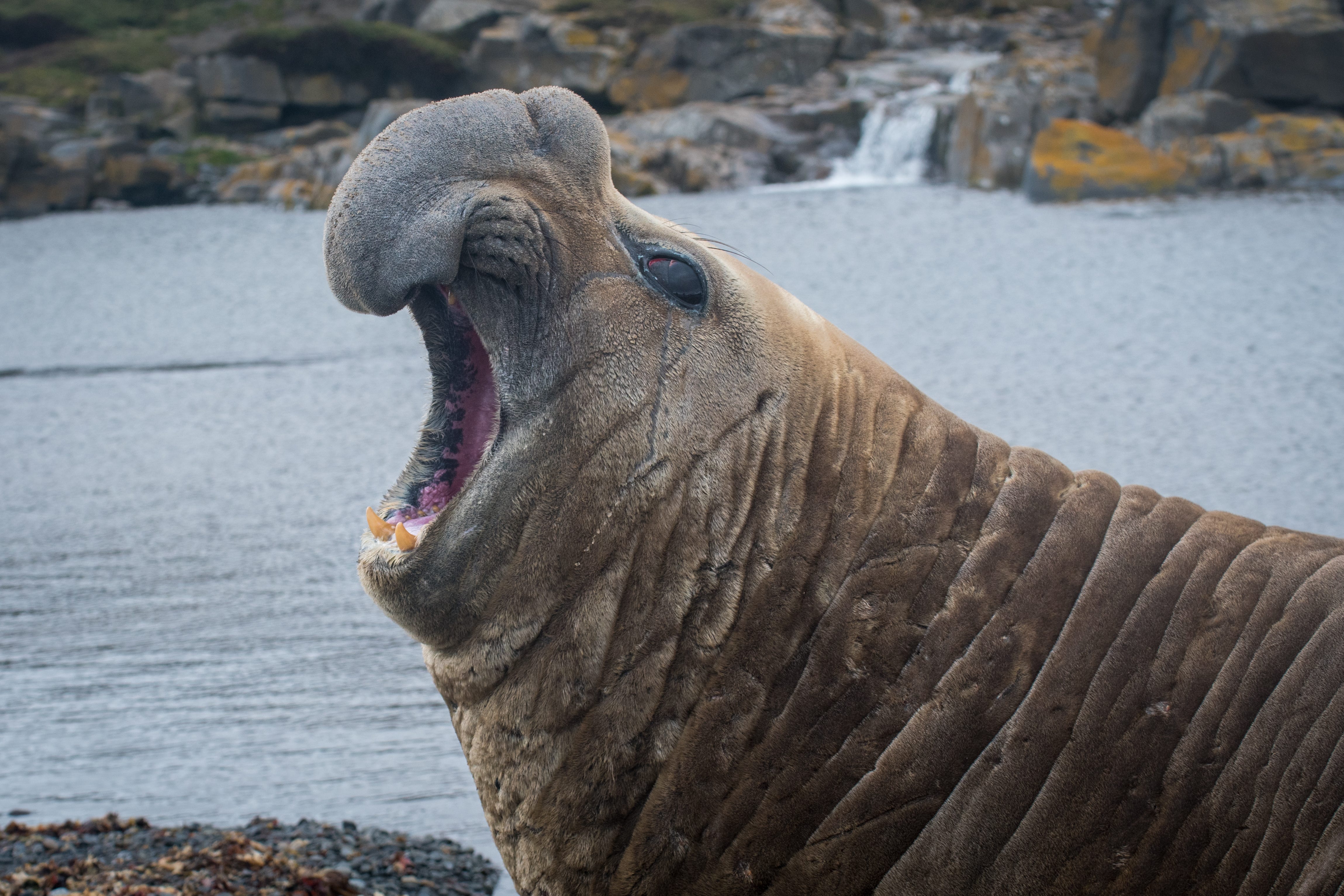
Consider this story by myself and Simon Ducroquet. It is not a complete narrative from beginning to end. But it opens by presenting a story about an elephant seal who, by swimming through warm water in an unusual location in 2011, inadvertently discovered a threat to a major Antarctic glacier.
Obviously, I was not there with the seal beneath the surface of the Southern Ocean to witness this.
But I could turn to the MEOP (Marine Mammals Exploring the Oceans Pole to Pole) program, in which scientists instrument elephant seals, transforming them into living sensors as they go on their incredible journeys. The program has data showing where this seal was, what the water temperature was, what the depth was, and so on.
These data, and their analysis by scientists, helped me to write sentences like these:
As summer in the Southern Hemisphere peaked, the seal made a standard Antarctic journey, but then went in an unusual direction.
In March 2011, he appeared just offshore from a vast oceanfront glacier called Denman, where elephant seals are not generally known to go. He dived into a deep trough in the ocean bed, roughly half a mile below the surface…
The seal swam through unusually warm water, just below the freezing point, but in the Antarctic, that is warm. Given its salt content and the extreme depths and pressures involved — in some regions Denman Glacier rests on a seafloor that is over a mile deep — such warm water can destroy large amounts of ice.
You can read the rest of this story here.
Thus, the second major way that data strengthens narrative journalism is by helping to identify and describe actual events in the timeline of the story.
There is much more to say about the linkage between data and journalistic story! However, this post was getting long, so I decided to divide it up into a two part essay. The second part will post shortly and when it does, will be linked here.
Chris, your 2022 data journalism on variations in sea-level rise foretells the present controversy wherein the EPA Administrator's proposal to rescind the agency's endangerment findings regarding greenhouse gas emissions states that aggregate sea-level rise has been minimal with respect to impacts on the U.S., rising in some locations while falling in others. It cites as its authority the draft report prepared by a working group hand-picked by the Secretary of Energy, since disbanded because it violated scientific advisory laws. More than 85 scientist quickly discredited the DOE report's findings https://sites.google.com/tamu.edu/doeresponse/home. RE sea-level rise they wrote the following.
"Sea-level rise is increasing risk to coastal communities. The rate of global-mean sea-level rise
has more than doubled over the last 30 years, from about 0.08 inches/year in 1992 to 0.18
inches/year in 2024, and statistical analysis also reveals sea-level acceleration at many U.S.
tide gauges and in contiguous U.S. tide gauges in aggregate. Along parts of the U.S. Atlantic
and Gulf coasts, the number of days of coastal flooding per year have increased more than
ten-fold since the 1970s as a result of sea-level rise, and relative sea-level rise is projected to
increase high-tide flooding by 5-10x on average across the country’s coast by 2050."
In other words, you and your collaborators were right — and the story was well told!
Don